Embracing Comic Sans
- Tommy Sangchompuphen

- Jun 2, 2022
- 2 min read
When I visited my son’s elementary school the other day, I had to complete and wear a paper visitor badge. It requested you to complete all the normal information (name, time, and classroom you were visiting) and stick it on your shirt.
The badge was printed in Comic Sans.
I made a remark to my son that the use of the Comic Sans font on a visitor badge was an inappropriate use of Comic Sans. Bolded Arial or Helvetica would have been a better use of a font.
As my oldest son usually does, he found my statement as another opportunity to correct me.
“Elementary school is supposed to be fun, so why not use a fun font that represents the school? Comic Sans is completely appropriate. But you need to be professional. You should never use Comic Sans.”
Well, misguided youth, I told my son, little do you know I fully embrace Comic Sans. But there’s a time and a place to use that font.
As you might remember, I freely use Comic Sans, as well as other fonts used by The Simpsons, The Beatles, Star Wars, and Pokémon, throughout my PowerPoints and handouts.
Why?
Tim Harford, an economist and author of the book Messy: How To be Creative and Resilient in a Tidy-Minded World, believes that ugly fonts like Comic Sans help people concentrate on what they’re reading.
So, while I recommend to students that the bulk of their outline and notes can be in the more popular Helvetica, Arial, or Times New Roman fonts, certain excerpts or rules should be in a completely different font, like Comic Sans—instead of the same font bolded, italicized, underlined, highlighted, or whatever means of making the same boring Helvetica, Arial, or Times New Roman font stand out more.
Harford referred to a previous study run by psychologists at Princeton University where a school teacher's handouts were reformatted in either easy-to-read or harder fonts.
"Those who got their handouts formatted in difficult, ugly fonts did better in their end of term exams across a variety of subjects," Harford pointed out.
Sure, the development of Comic Sans has led to the strongest anti-font movement currently in existence, with followers of the movement saying the font has no place in business or professional work usage. And that might be true. And, yes, my son might be correct.
But law students and examinees aren’t filing their outlines and notes with courts. They aren’t turning them in for grades. The outlines and notes are designed to help them learn, memorize, and understand vast amount of material.
Whatever helps with that process, I advocate.

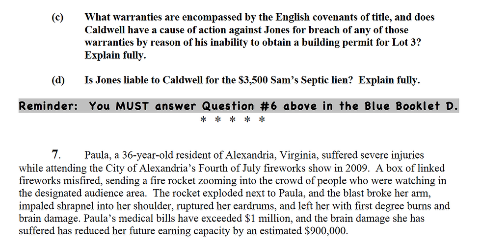
Even Comic Sans has been used by bar examiners. The Virginia Board of Bar Examiners in 2011 used Comic Sans in its essay testing packets to remind examinees to handwrite the correct essay response in the correct examination “blue book.” And not only was the reminder in Comic Sans, but it was bolded and highlighted. I can picture the VBBE saying, to the examinee who included the wrong handwritten response in the wrong “blue book,” how did that instruction not stand out to you!


